Surveys (in their various forms) within emails are a great way to use email marketing for customer support, customer success, and social proof for marketing purposes, especially when it comes to getting more value out of your customers through email if they’ve already purchased your product or service and you don’t have a whole lot else to sell to them.
When it comes to actual survey implementation within an email, there are a few things to consider, the first being the format and function of your survey itself. Surveys take various forms ranging from long winded questions with multiple choices, long responses, to a simple thumbs up or thumbs down.
Satisfaction and NPS surveys in emails
Satisfaction and NPS surveys are great for services businesses to get feedback throughout the customer lifecycle and determine where the gaps in those services exist to improve the experience. The simplest satisfaction surveys often take the form of the example below – with just a few options presented to the recipient.
The actual implementation of this type of satisfaction survey into an email is actually quite simple – and is done with side by side images in a table structure, with each image having a unique link to record the response with a couple of extra options.
For example:
The ‘Hate it’ icon would link to https://mysite.com/surveyresponse/hateit, whereas a click of the ‘Love it!’ icon would link to https://mysite.com/surveyresponse/loveit. In each case, nearly all email marketing platforms will track the particular link click, and with any even rudimentary automation would allow you to update a custom field with the name ‘survey’ with the appropriate response, or use a tool like Zapier to log the aggregate responses when one of those links are clicked.
With our clients, we typically recommend taking it a step further, with the negative responses linking to the page which includes information about how to contact customer support to explain the issues they’re facing, and for positive responses, get additional info and refer them to review the company across the web.
NPS (Net Promoter Score) surveys are very common, and widely considered to be a good measure of the overall customer experience. The actual format of the survey is quite simple:
“Using a 0-10 scale: How likely is it that you would recommend [brand] to a friend or colleague?”

Based on that single question and rating scale, it’s easy to see that actual implementation of the NPS survey is nearly the same as the satisfaction survey implementation we referenced before, simply with a bigger table and with 11 images for each number on the scale with 11 unique links to click and track.
Review Forms in Emails
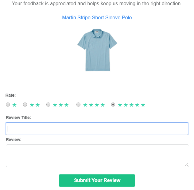
Surveys asking for the reader to leave a review directly in the email are quite common, particularly in ecommerce businesses for products that customers have recently purchased. The format of the survey typically takes the shape of a 1-5 star rating, plus a few text fields to enter comments about the product and a review of it.
While many organizations drive people back to the product page – it is possible to place a traditional html form in email. To actually do it requires understanding it’s limitations first.

Some Limitations of HTML forms in Email
While some email clients do support actual form embeds and will post data to the source upon submission, much like HTML support in general for email, it comes with many limitations.
- Limited and inconsistent styling/layout – Formatting may look different depending on the email client used, as Gmail has different styling rules than Yahoo Mail, Apple Mail, etc. If the layout and style is not done simply, you can run into situations where your forms do not render properly.
- Limited form error handling – Error handling for things like required fields may have limited support at best depending on the email client. It’s wise to keep your forms simple with little required fields or need to run validation on the answers.
- Limited form field types – Most email clients only support text or paragraph inputs, radio buttons, and checkboxes. More complex input types with validation like datetime fields and drop downs are likely not to be supported across different email clients.
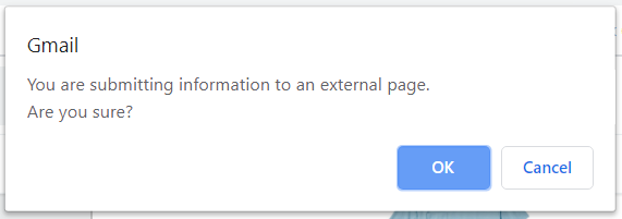
- Security warnings when submitting form – Because of the fact you’re submitting data to an external page from within the email clients’ ecosystem, email clients like Gmail will display a warning to confirm the data submission prior to actually sending it. If your subscriber base is sensitive to their data and security, this may be a turnoff and in fact trigger some subscribers to be suspicious of future emails from you.

How to go about implementing your survey in emails
To figure out which form factor works for your needs, you first need to truly consider which survey questions are going to actually provide the value for you to learn what you need to understand about your subscribers. If your surveys act like reviews, more context about what in particular made the customer happy they purchased the product means requiring text answers. On the other hand if your surveys are a simple measurement of the customer experience, a satisfaction or NPS survey will do the trick without much more context.
If you’re HTML savvy, the implementation of just about any of these survey types is either a combination of table structure and images with links (satisfaction/NPS), or a very simple HTML form. The thing to understand here is the limitations around the layout and styling in email, and the need to be mobile responsive with email – which is often easier said than done without expertise.
If you’re not HTML savvy, you can likely get away with building out a relatively simple satisfaction or NPS survey in multi-column blocks with images embedded, again just be aware that these blocks often stack strangely if you have too many on one line, and can affect the order in which the options are presented and thus introduce bias to the surveys. For a standard form, there are some 3rd party tools that you can build your form, copy the html code, then embed and use the tool to track submissions, just be aware that they are unlikely to be supportive of embedding them in email, won’t be able to guarantee rendering across all devices, and are going to cost you some money.
Our recommendation on embedding surveys in emails: Keep it simple
Rather than risk rendering issues that come with complex forms – we recommend using a simple satisfaction type survey for topline understanding of feedback from your subscribers. This way your emails and surveys are more likely to render across all devices without a wonky experience and your subscribers can leave quick and convenient (to them) feedback. From there, if you need to collect more data, you can use the url links on the satisfaction images/text to collect information about what they like/don’t like about your product or service on a more thorough form.
If you do need to embed a complete form in your email, our recommendation would be to of course, keep the form as simple and clean as possible, and secondly, offer a text link with language around “Having trouble leaving a review, click here to review on the product page” which takes people to a page on your site to leave the same information.
The less variables you have, the more likely you are not only to get responses, but the more likely your surveys will render properly in general.
Need the help of email and marketing automation experts to get your surveys embedded in email and connected with the rest of your data and technical stack?
Let’s chat.
*Further reading about rendering differences and functionality support of forms in emails can be found here: https://www.sitepoint.com/forms-in-email/
